
Color Palettes Interior Designers Are Specifying for 2026 Luxury Kitchens
Color is usually the hardest decision to make alone, since a palette that looks right on a paint chip can feel completely different once it covers an entire wall or a full run of cabinets. Lighting changes it, the size of the room changes it, and the finishes sitting next to it change it too. A warm taupe that looks soft and inviting in a north-facing kitchen can read muddy in a room that gets strong afternoon sun, and a deep green island that looks rich in a showroom photo can feel heavy in a smaller galley kitchen. This is where working with a design-led kitchen studio pays off, because a designer can see how a color will actually behave under your lighting and against your countertops before you commit to it, rather than after the cabinets are already installed. If you are weighing a full remodel, custom design kitchens built around your chosen palette can help you avoid the trial and error of testing swatches on your own walls, and can make sure the finished space still feels like yours rather than a copy of a magazine spread.
What Color Trends Are Defining 2026 Luxury Interiors?
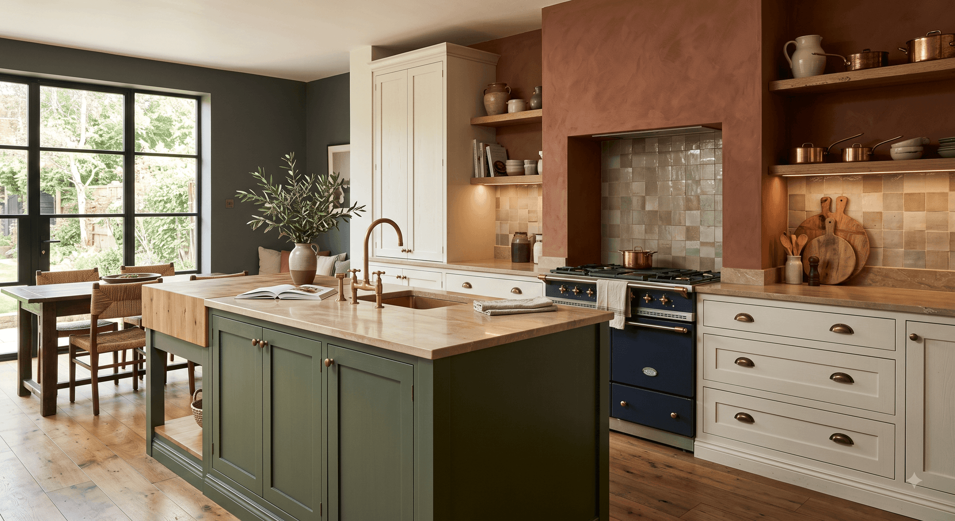
The 2026 interior design color trends lean toward warmth and depth rather than stark contrast. Instead of the crisp white-on-white kitchens that felt ubiquitous a few years ago, designers are pairing creamy off-whites with earthy terracotta, olive, and mocha tones, then adding a single deep accent, like ink blue or forest green, to ground the space. The idea is to build a palette with some tonal movement in it, so the eye has somewhere to land, instead of a single flat color repeated across every surface. Metallics have softened along with the palette itself, with brushed brass and aged bronze replacing chrome and polished nickel on faucets and cabinet pulls, partly because warm metals sit better against these earthier tones and pick up the warmth of natural wood cabinetry rather than fighting it.
Texture is playing a bigger role in how these colors get used, too. A matte or honed finish on countertops and tile reads very differently than a high-gloss one, even in the exact same color, and designers are leaning toward the softer, more matte finishes that suit this warmer palette. Put together, the goal is a kitchen that feels lived-in and warm rather than clinical, a space that looks like it belongs to a specific household instead of a catalog page. Color is really just one part of this shift, and our guide to the home decor trends shaping homes in 2026 covers the other design shifts happening alongside it, from materials and lighting to how kitchens are being laid out this year.
What Kitchen Cabinet Colors Are Trending Right Now?
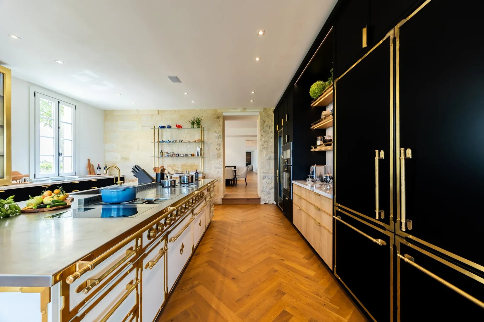
Among kitchen color trends for 2026, cabinetry is still the biggest style statement a homeowner can make, since it covers more surface area than any other single element in the room. Two-tone cabinets remain popular, but the pairings have shifted noticeably. Instead of the black-and-white combinations that felt fresh a few years ago, designers are now combining warm taupe or greige lowers with cream or bone uppers, a pairing that feels calmer and less contrasty in person than it looks in a rendering. Deep, muted greens such as sage and olive are also showing up on kitchen islands, where they work well as a bold focal point without overwhelming the surrounding cabinetry, especially when the perimeter cabinets stay in a lighter, warmer tone.
For a more traditional look, soft butter and warm ivory tones are being used across full cabinet runs to bring brightness into the room without the flat, cold effect pure white can create under certain lighting, particularly in kitchens that get a lot of natural light from north-facing windows. Designers working on larger kitchens are also starting to treat the island, the perimeter cabinets, and any pantry or butler's pantry cabinetry as three separate color decisions rather than one uniform choice, which gives the room more depth without making it feel busy. A kitchen that reads as effortless usually has two or three cabinet colors working together, not one color trying to do everything on its own.
Source: https://www.leatelierparis.com/
Which Paint Colors Work Best for a Luxury Kitchen in 2026?
When it comes to paint colors for 2026, warm neutrals are clearly outperforming the cool grays that dominated kitchen walls for years. Shades like clay, wheat, and soft caramel create a backdrop that flatters natural stone countertops and wood cabinetry, since warmer wall tones bring out the veining in marble or the grain in white oak rather than competing with it. Cool grays, by contrast, can make warm wood tones look slightly dull or make white marble look a little blue and clinical, which is part of why designers have moved away from them for kitchens specifically, even in homes where cooler tones are still used in bathrooms or bedrooms.
For a statement wall or a moody dining nook just off the kitchen, deep charcoal, espresso brown, and muted navy are popular, especially paired with brass lighting and warm-toned wood floors. These deeper colors tend to work best in a room that gets good natural light during the day, since a dark wall can start to feel closed-in in a windowless space. Designers are generally suggesting one dominant wall color with a single deeper accent, rather than the multi-tone approach that was common a few years back, since it gives the eye a clear place to rest and keeps the kitchen from feeling like a paint sample board.
Make Your Kitchen Stand Out
Explore premium kitchen ranges designed to bring style and performance together.
What Colors Are Trending for Kitchen Appliances and Ranges?
Appliance color is no longer an afterthought in luxury kitchen design, especially for the range, which tends to sit at the visual center of the room and is often the first thing a guest notices when they walk in. Matte black and deep navy ranges are being specified as anchor pieces, particularly in kitchens with lighter cabinetry, since the contrast keeps the room from feeling flat and gives the eye a clear focal point without needing extra decor. Cream and off-white ranges are also gaining ground in farmhouse and French-country style kitchens, where a soft, vintage-inspired finish fits the room far better than stainless steel ever could, and tends to age more gracefully than a finish that shows fingerprints and water spots.
Designers are increasingly treating the range like a piece of furniture, choosing a finish that complements the wall color and cabinetry on purpose, rather than defaulting to whatever is easiest to find in stock. That means the range color is often chosen early in the design process now, sometimes before the wall paint is finalized, rather than being an afterthought once everything else is already installed. Hood design has followed a similar path, with more custom, plastered, or paneled hoods appearing in a color that ties the range back into the surrounding cabinetry instead of standing apart from it in bare stainless steel.
How Can You Bring These Luxury Color Palettes Into Your Own Kitchen?
You do not need a full renovation to bring these palettes home. Repainting the kitchen island in a deep, muted tone while keeping the perimeter cabinets a lighter warm neutral is a low-risk way to test the look, since it gives you a bold moment without committing the whole room to it, and it is one of the easier changes to reverse later if your taste shifts. Swapping chrome or nickel hardware for brushed brass or aged bronze pulls and faucets changes the feel of a kitchen more than most people expect, often for a fraction of the cost of a full cabinet repaint, and it is usually a weekend project rather than a full renovation.
If you are choosing a range or major appliance, picking a finish that contrasts intentionally with your cabinet color tends to read as more current than matching it exactly, since a color that stands slightly apart from the cabinetry gives the room a clear focal point. For anyone who wants to soften a bold wall or cabinet color, layering in warm-toned wood accents, like open shelving or a butcher block section on the island, brings balance back into the room without needing to repaint anything. If you want smaller updates to start with before deciding on a bigger palette change, our roundup of simple home decor upgrades that instantly elevate any space has a few changes you can make this weekend.
Warm taupe, greige, and soft olive tones are leading the trend, often paired with cream or bone-colored uppers for a two-tone look. Designers are also treating islands as a separate color decision from the rest of the cabinetry, using a deeper sage, olive, or navy island against lighter perimeter cabinets to create a focal point without a full-room color change.
The overall trend is warm and layered rather than stark. Cool grays and pure white are giving way to earthy neutrals, muted greens, and deep accent tones like navy and espresso, usually built around one dominant neutral with a single deeper accent rather than several competing colors in the same room.
Matte black and deep navy are popular for a bold, anchor-piece look, especially in kitchens with lighter cabinetry where the contrast keeps the room from feeling flat. Cream and off-white finishes are trending in farmhouse and French-country style kitchens, where a softer, vintage-inspired range tends to suit the rest of the room better than stainless steel.
White kitchens have not disappeared, but the shade of white has changed. Designers are moving toward warmer whites like cream, bone, and ivory instead of the stark, cool whites that were common a few years ago, and they are pairing them with warm brass or bronze hardware rather than chrome or nickel to keep the room from feeling clinical.
Warm, muted neutrals like clay, wheat, and soft caramel tend to read as more expensive than stark white or cool gray, largely because they flatter natural materials like marble, wood, and brass rather than competing with them. A single deep accent color, used sparingly on an island or a statement wall, also tends to make a kitchen feel more intentional and designed rather than default.

Marcus Ellery
Marcus Ellery is a U.S.–based design writer and home–living enthusiast with a passion for exploring how thoughtful craftsmanship shapes modern spaces. With over a decade of experience covering kitchen innovation, luxury interiors, and architectural design trends, Marcus brings a balanced blend of storytelling and technical insight to every piece he writes.


Join Our World of Design & Cuisine
Receive curated stories on French craftsmanship, design inspirations, and culinary living — straight from French Ranges USA.