
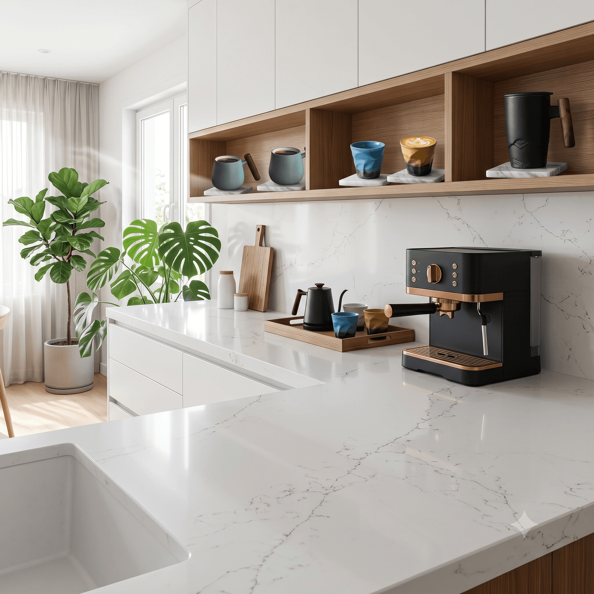
How to Style a Small Coffee Corner Without Making the Kitchen Feel Crowded
A small coffee corner usually goes wrong in a very ordinary way. The mugs are attractive on their own, the tray looked useful when it was bought, the syrup bottle seemed small enough, and one extra canister did not feel like a real decision. Then a week later the corner looks busy, the counter feels tighter, and the morning routine is slower instead of calmer.
That is why good coffee-corner styling is not only about decoration. It is about function, spacing, and a few practical choices that still look good after the first burst of enthusiasm wears off. In smaller kitchens especially, the best coffee corner is one that helps the room feel more settled, not more crowded. Designers who work on custom kitchen layouts often point out that a dedicated, well-defined coffee zone is one of the first things that makes a compact kitchen feel thoughtful rather than improvised.
If you like a warmer European or lightly French-inspired mood, the same rule still applies. A calm coffee corner does not need many objects. It needs the right objects, a clear routine, and enough open space around them to keep the whole area breathable.
What makes a small coffee corner feel intentional instead of cluttered?
The fastest difference is visual restraint. In a small kitchen, every object is doing two jobs at once: it solves a practical need, and it changes how crowded the room feels. A coffee setup looks intentional when the pieces belong to one another in size, finish, and purpose.
That usually means:
one main brewing area instead of two overlapping zones
mugs that can work as daily drinkware and visual accents
a tray or board that groups smaller items together
enough empty counter around the setup to keep it from spreading
The mistake many people make is styling the whole counter instead of styling one defined pocket of space. A compact coffee corner works better when it is treated almost like a vignette inside the kitchen: one area, one rhythm, one set of tools.
In our experience, the most useful starting question is not "What looks pretty here?" It is "What do I reach for every morning?" Once that answer is clear, the styling becomes much easier.

Design your kitchen around what matters most
Handcrafted French ranges and custom kitchen designs for homes that take cooking seriously.
Start with the routine, not the accessories
Before adding decorative pieces, it helps to watch the real routine for a day or two. Which items are actually used every morning? Which ones come out only when guests visit? Which pieces slow the process down?
For most people, the true daily set is small:
the brewer or kettle
two to four mugs
coffee or tea storage
a spoon rest or small bowl
one tray, board, or narrow shelf zone
Everything beyond that should earn its place. If a milk frother, sugar jar, syrup bottle, stack of extra cups, and decorative sign all compete for the same thirty inches of counter, the corner starts to feel crowded before the day even begins.
This is where smaller kitchens benefit from a styling approach borrowed from good dining rooms and tidy open shelving: use fewer objects, but let each one read clearly. A ceramic mug with a good shape, a container with a clean silhouette, and one warm-toned tray often do more for the space than six decorative fillers ever will.

Choose mugs that help the corner look calm
Mugs matter more than people expect because they are usually the most visible objects in the coffee corner. They add shape, color, and scale, but they also set the tone. If every mug is a different size, style, and finish, the corner reads noisy even when it is technically organized.
For a smaller kitchen, mugs usually work best when they follow one of these paths:
A matched set in one color family.
A small mixed group with the same material and similar proportions.
Two functional daily mugs plus one slightly more decorative accent mug.
This does not mean the space should feel flat or overly coordinated. It just means there should be one visual story. If the kitchen leans warm and classic, soft ceramics, rounded shapes, and cream, stone, or muted green tones will usually feel easier to live with than a random mix of novelty graphics. If you are drawn to that kind of quietly European aesthetic, Coffeify Mug has a good range of ceramics that sit well in warmer, classic kitchen setups without competing with the rest of the space. If the kitchen is more minimal, cleaner lines and fewer surface details tend to keep the counter feeling open.
A useful detail here is height variation. One taller mug and one rounder mug can create a layered look without adding clutter, especially if the finishes still relate to each other. That kind of variation feels deliberate. Five unrelated mug silhouettes in the same small zone usually do not.

How much should stay on the counter?
Less than most people think. A small coffee corner feels better when the counter still has breathing room around it. That empty space is not wasted space. It is what lets the setup feel designed instead of crowded.
A practical rule is to keep the active coffee zone visually contained to one tray, one board, or one section of counter with a clear edge. That edge might be a marble slab, a wood board, or even the visual stop created by the coffee machine itself. Once the setup spills beyond that line, the kitchen starts to feel busier.
Here is a simple breakdown:
Keep everyday items on the counter.
Move backup mugs and bulk supplies into a cabinet.
Store seasonal extras somewhere else until they are actually needed.
Use vertical shelf space only if it stays easy to clean and easy to reach.
This last point matters. Open shelves can look beautiful in photos, but they only work in real kitchens when the items on them are used enough to justify the dusting and rearranging. If the shelf becomes a place where decorative mugs sit untouched while daily mugs crowd the counter below, the corner is not helping the room.
Use one warm layer, not five decorative ones
If you want the setup to feel styled, add one warmth-building layer instead of many small props. That might be a walnut tray, a linen napkin under the sugar bowl, a brass spoon, or a small ceramic dish for coffee scoops. One well-chosen layer gives texture and character without turning the space into a display table.
This is where a light French-inspired direction can work especially well. The goal is not to mimic a themed kitchen. It is to borrow a few cues that feel timeless: natural wood, soft stone shades, relaxed ceramics, and useful objects that also happen to look good. That same sensibility carries through to the kitchen itself; it is worth reading about how French ranges work in small kitchens if you are considering a larger refresh alongside the styling work.


Join Our World of Design & Cuisine
Receive curated stories on French craftsmanship, design inspirations, and culinary living — straight from French Ranges USA.
More from kitchen Remodeling